Case study · Mobile App · 2026
Fatafat - Mumbai Transit Companion
A transit app that treats rider confidence as a first-class design input
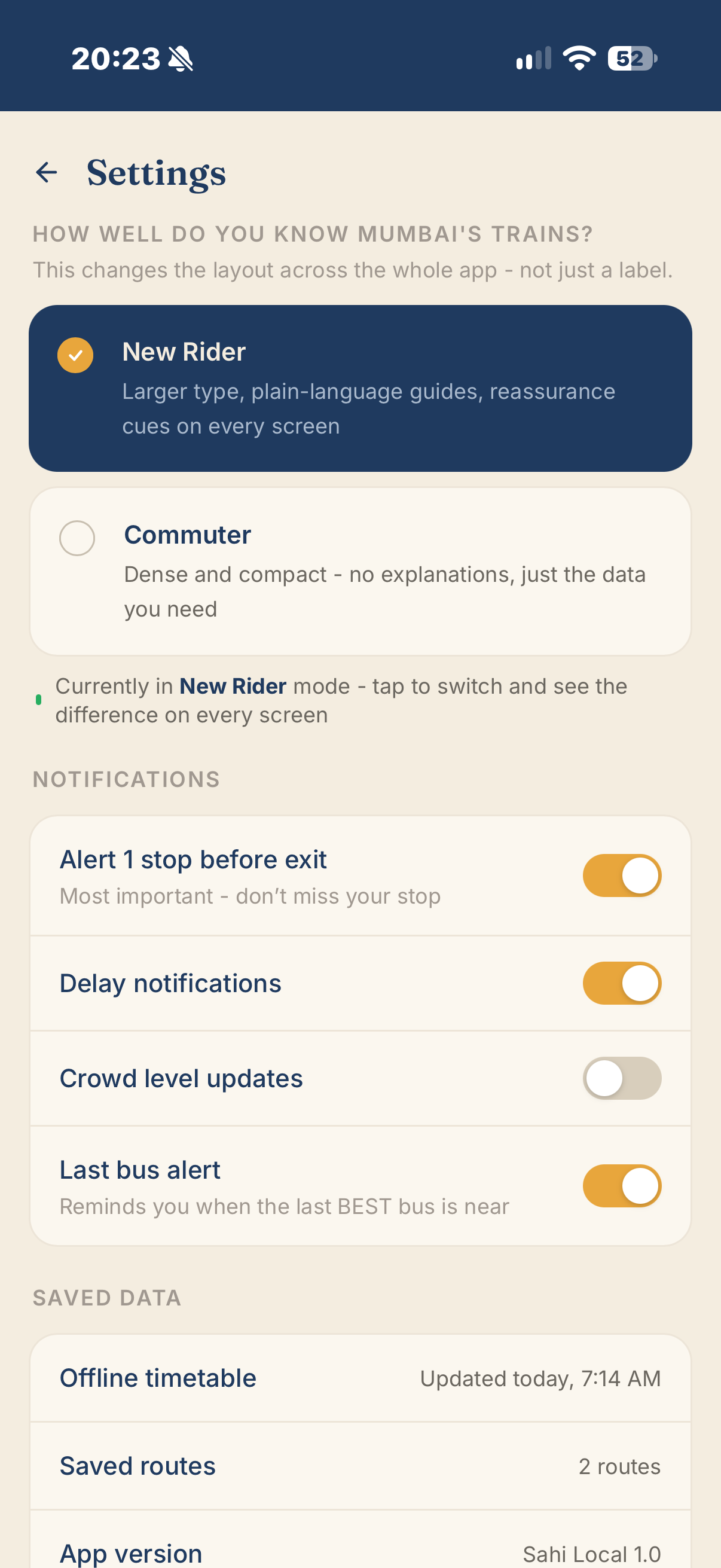
A companion app for Mumbai's suburban rail network - the busiest commuter system on Earth - designed around progressive disclosure. The same screens flex information density up or down based on how well a rider knows the system, answering the question every commuter actually has: should I wait, or should I board right now?
Mumbai’s suburban rail network moves roughly 7 million people a day - and the digital tools meant to help haven’t kept pace with the system’s complexity.
The “Locals” - Central, Western, and Harbour lines - are the busiest commuter rail system on Earth. Fast and slow trains share platforms with no clear signage logic, crowd levels shift by the minute, and a single signal fault can cascade into an hour of chaos.
m-Indicator, the dominant app with roughly 10 million installs, is trusted for its core data but has sprawled into job listings, property classifieds, and entertainment schedules. Mumbai One, the government’s newer ticketing app, treats journey planning as a means to a transaction, not a source of real-time confidence. Both apps share the same failure pattern: they work well when the system is running on schedule and degrade exactly when riders need them most.
Neither app addresses a more fundamental gap: every rider sees the same screen, regardless of how well they know the system. A commuter who has ridden the same route for ten years and someone who arrived in Mumbai last week are shown identical density of information. For an experienced rider this is merely inefficient. For a new rider, standing on a platform with 30 seconds to decide whether to board, it is the difference between a manageable commute and a genuinely anxious one.
This project asks: what would a transit companion look like if it treated rider confidence as a first-class design input - flexing information density based on how well someone knows the system - while adding the one feature no existing app offers: a plain-language answer to the question every rider actually has, which is not “what’s the schedule” but “should I wait, or should I board right now?”

Priya and Arjun ride the same trains, at the same stations - but they need almost opposite things from an interface
Priya - The Confident Commuter
- Who: Rides the same Western Line route to work five days a week, has done so for years
- Entry point: Home widget - one-tap access to her daily commute
- Core need: Speed and certainty. Next train, crowd level, fastest bus connection - nothing else in the way
- Pain today: Existing apps make her dig past irrelevant content to get one piece of live information
Arjun - The Anxious Newcomer
- Who: Recently moved to Mumbai for work. Has ridden the Locals a handful of times, always with some anxiety
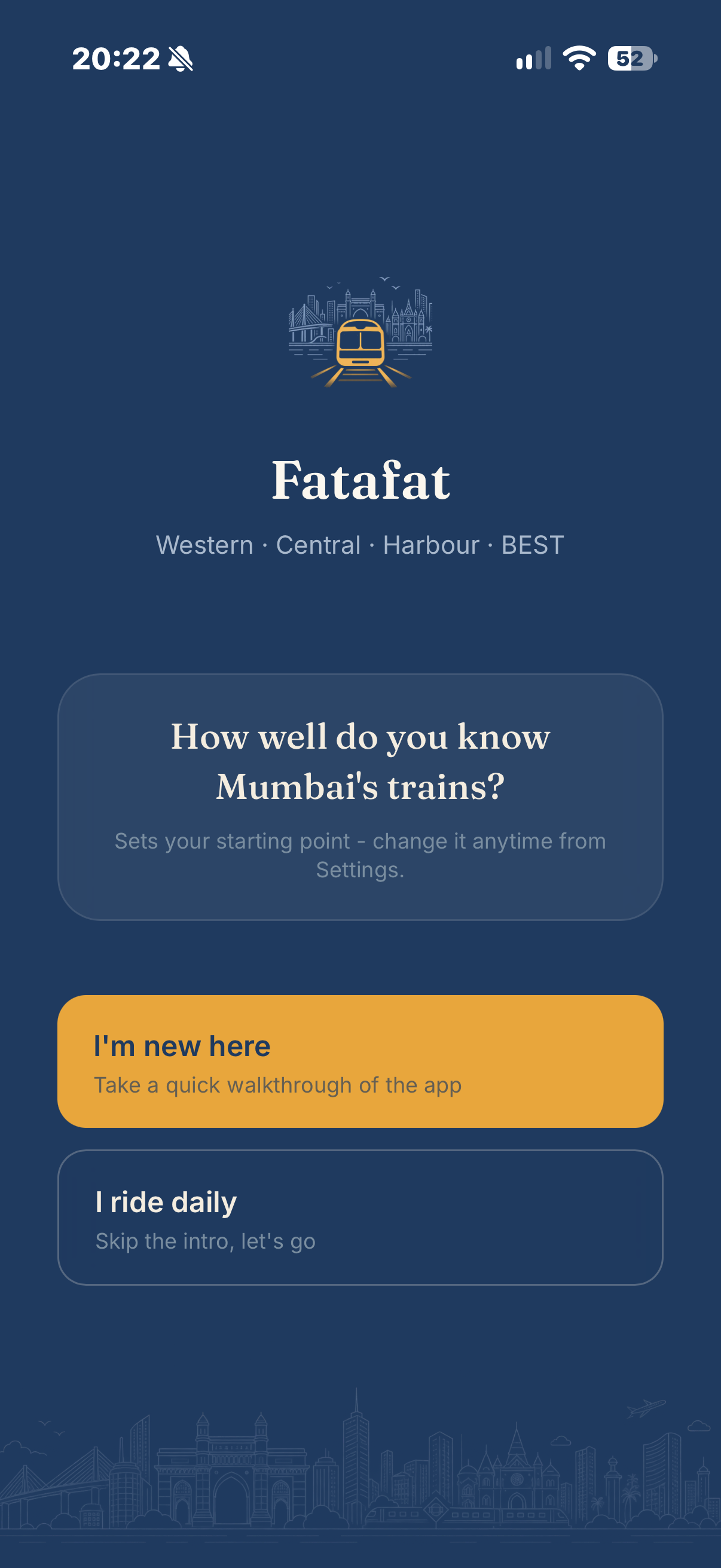
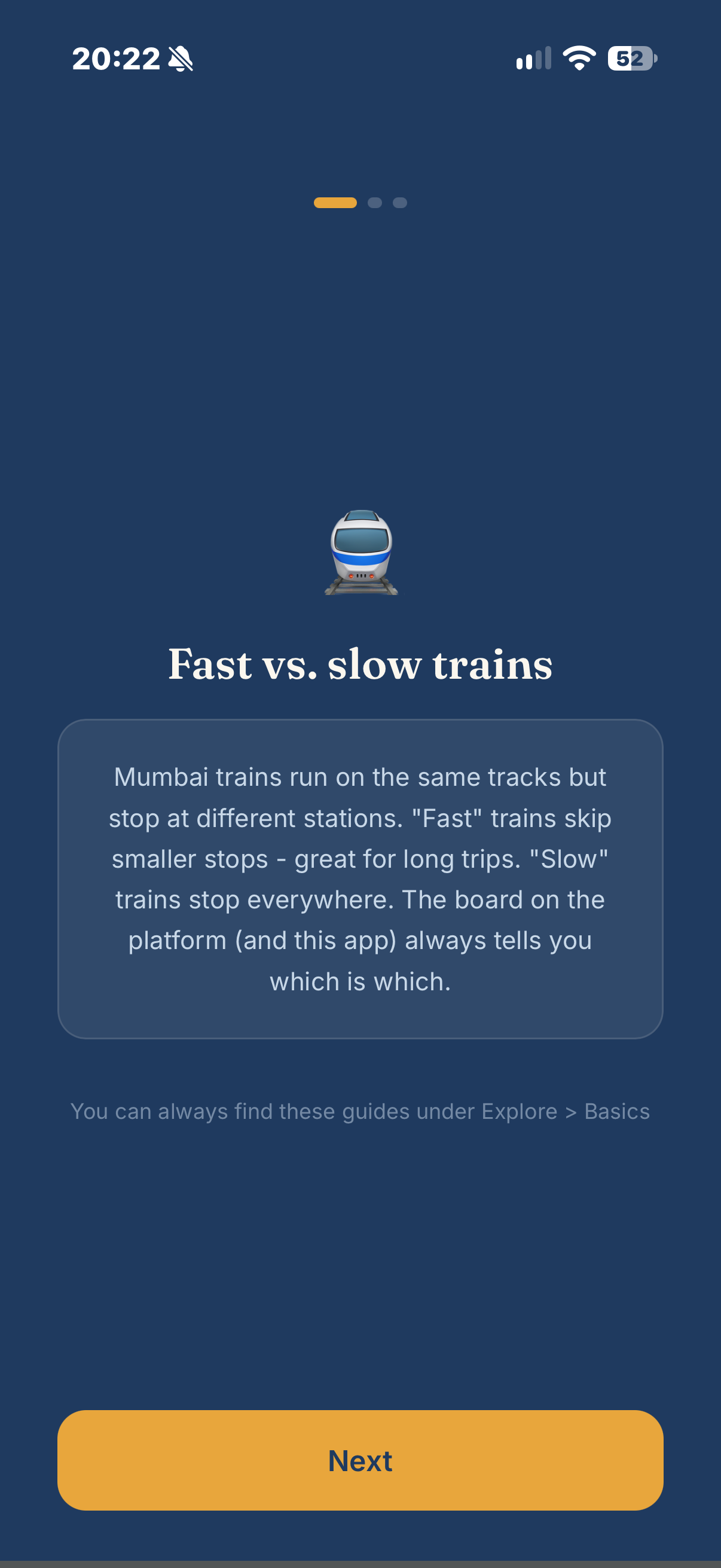
- Entry point: Home card - “New to Mumbai trains?” with compartment guide, fast vs. slow explainer, fare basics
- Core need: Not get it wrong. Doesn’t yet know the difference between fast and slow trains or which compartment to stand near
- Pain today: Every existing app assumes baseline knowledge he doesn’t have
Progressive disclosure is the mechanism that lets one app genuinely serve both: the same screens, but flexed in density and language depending on where the rider sits on the confidence spectrum. This is the throughline the rest of the case study builds around.
Four tabs, one settings icon, three shared components - deliberately tight scope as a direct counterpoint to the sprawl documented in the competitive teardown
A 4-tab bottom navigation: Home (dashboard), Live Status, Routes (search), and Tickets. Settings is a persistent icon, not a fifth tab - bottom-nav space is the app’s scarcest real estate, reserved for daily-use destinations rather than a setup-once screen.
Entry Points
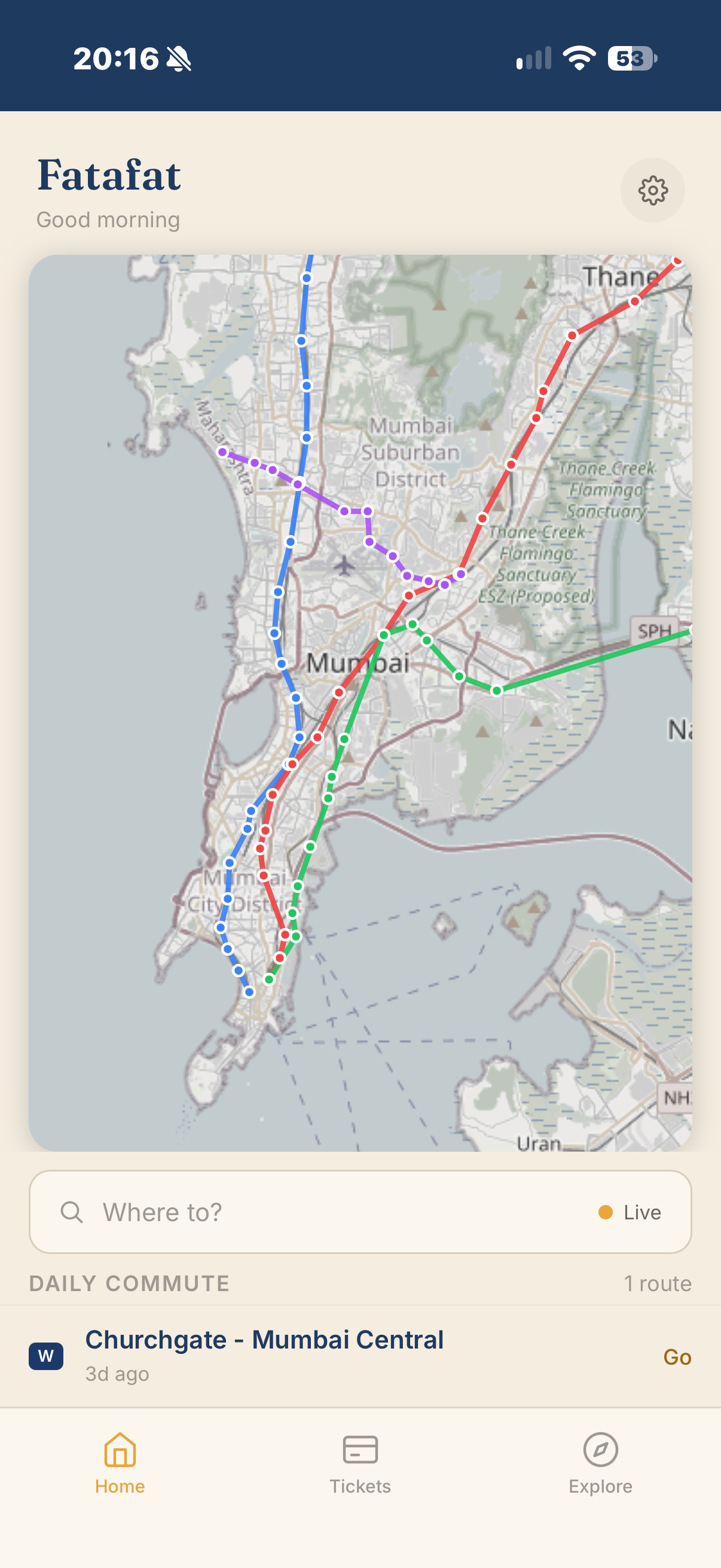
- Home: Glanceable dashboard - commuter widget or new-rider card depending on mode
- Live Status: Next departures from a chosen station, crowd density, “wait or board now” recommendation
- Routes: Full origin/destination search with depart-at and reach-by toggle
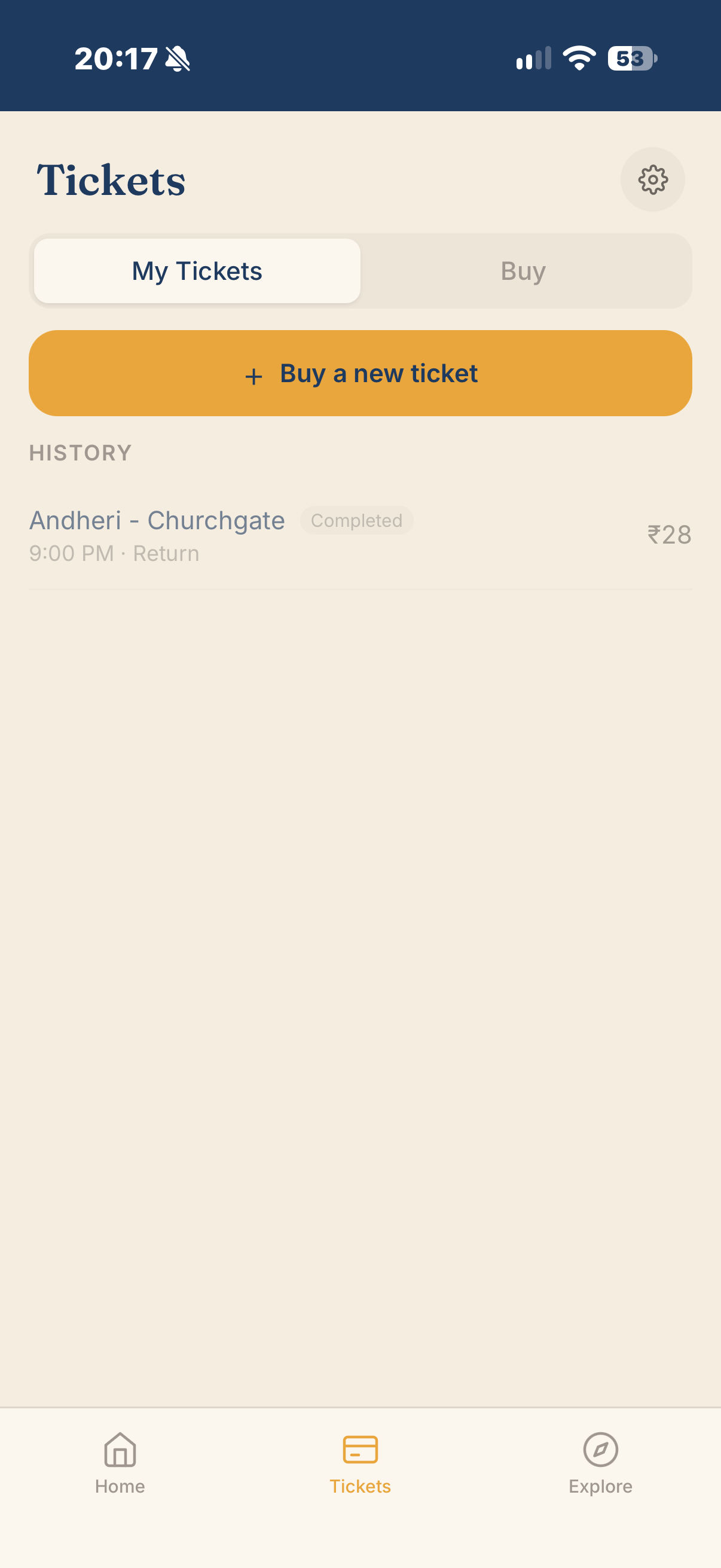
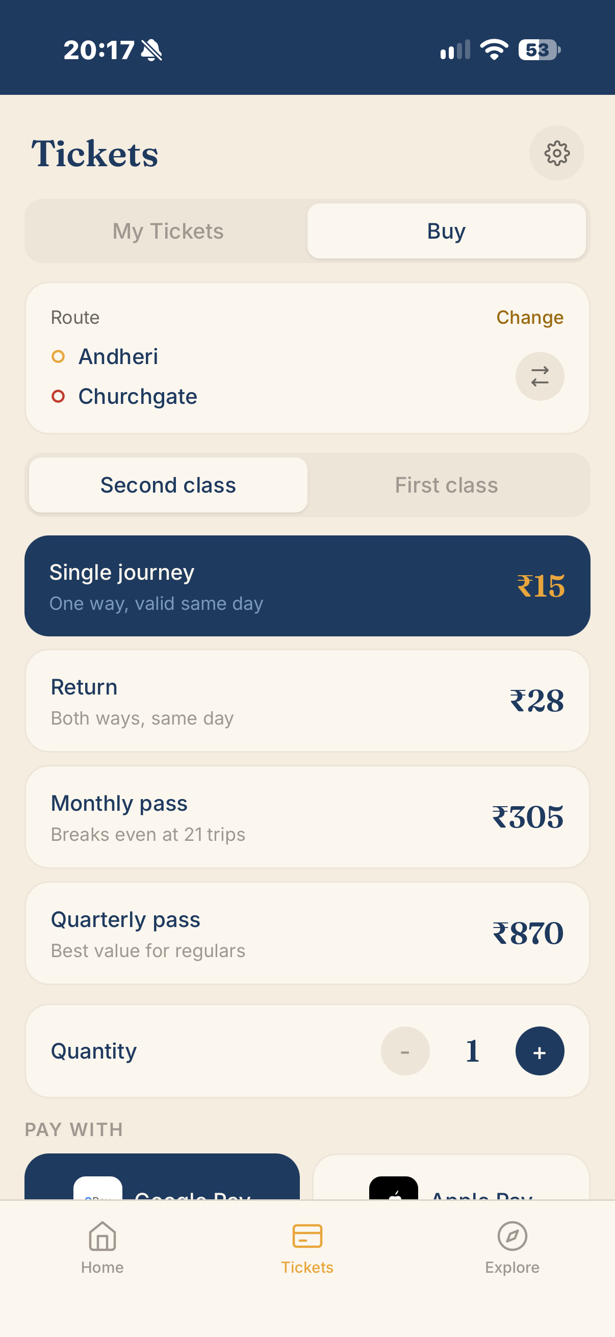
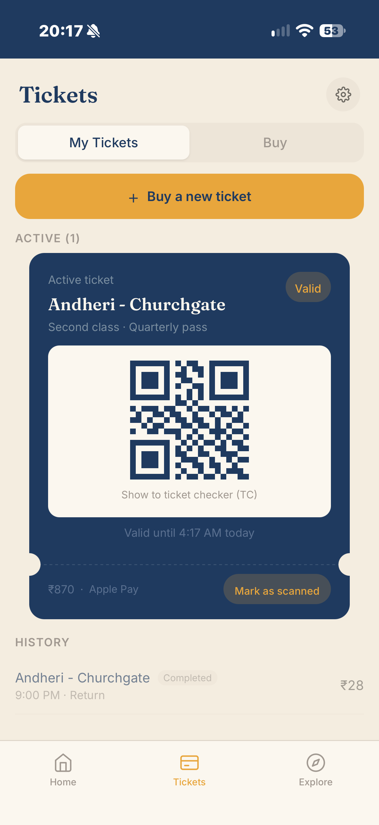
- Tickets: Buy single, return, or pass tickets; view active and expired tickets with QR codes
Drill-Ins
- Journey Detail: Full train + bus leg, reached from Home, Live Status, or Routes - two states depending on destination context
- On Board: Active-journey tracking, reached only after tapping “I’m on this train” - boarding confirmation and live-data contribution are the same interaction
- New Rider Screens: Compartment guide, fast vs. slow explainer, fares - swipeable between each other
Three shared components tie these destinations together - reused across screens rather than duplicated, keeping the app’s surface area tight:
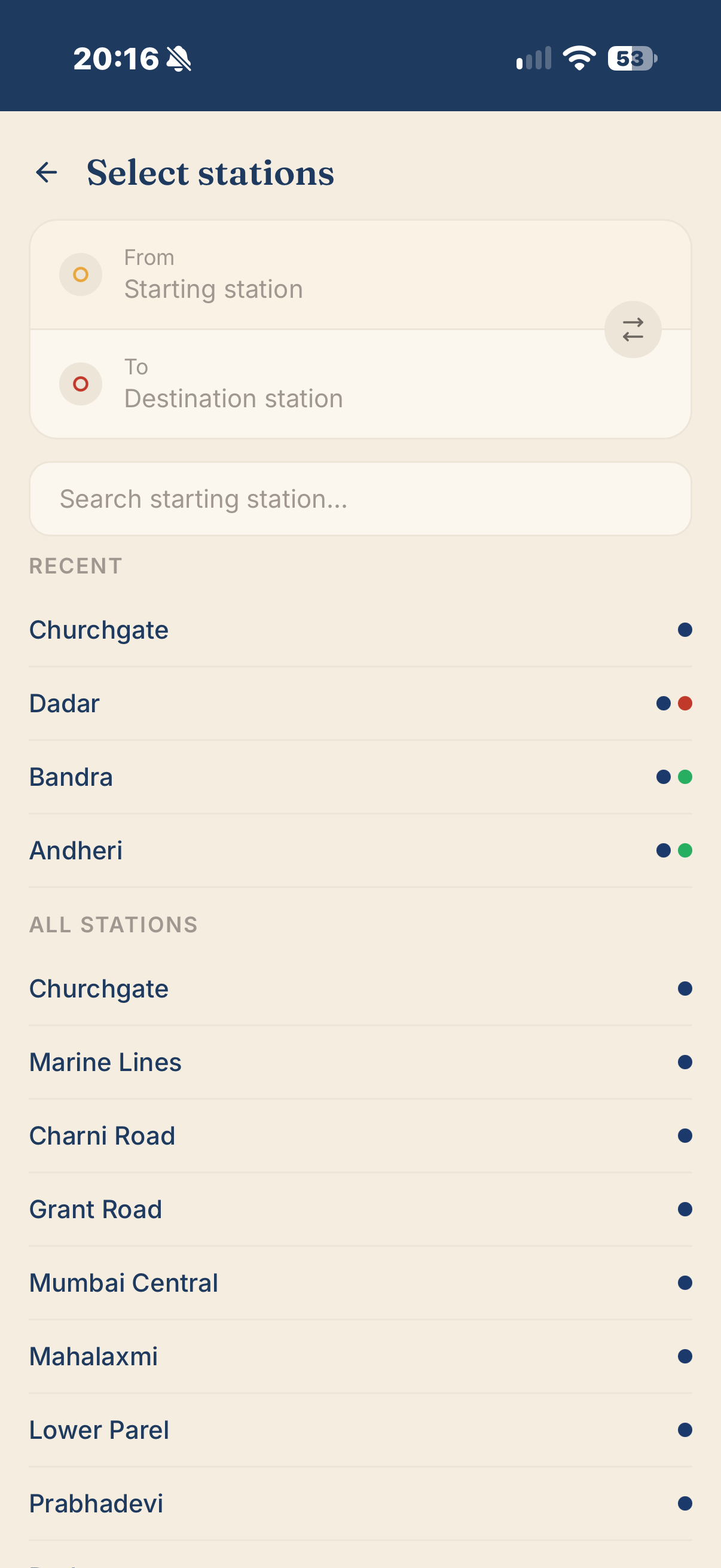
Station Picker
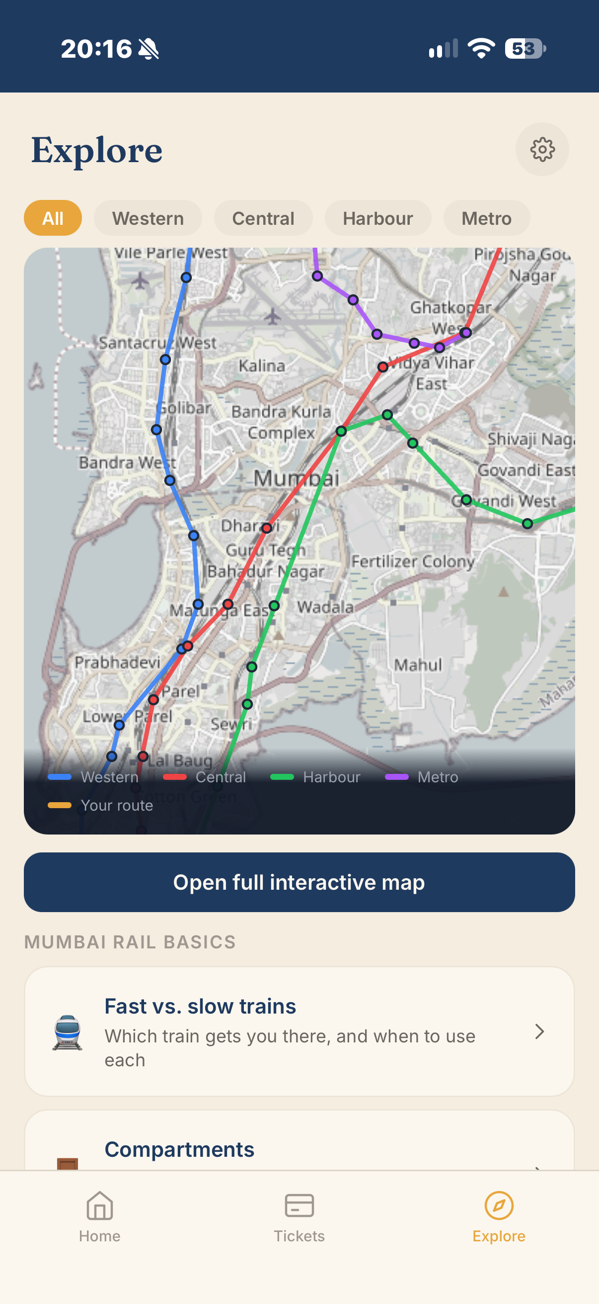
A shared component (search, recent, starred, current location) used by every “From/To” field across Home, Live Status, Routes, and Journey Detail. Each result carries line badges so interchange stations show which lines they serve.
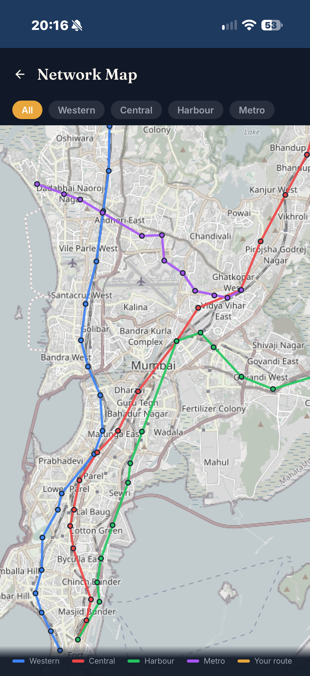
Network Map
Color-coded by line with a legend, reachable from Live Status, Routes, and Journey Detail. The current route highlights against the full network - useful for Arjun especially, who won’t have the layout memorized.
Fare Details
Single, return, monthly, and quarterly pricing by class. Feeds directly into the Tickets tab’s purchase flow, since ticket buying is in scope.
The core loop: find a route, see the live picture, board, and track your ride - with the interface flexing at every step based on rider confidence
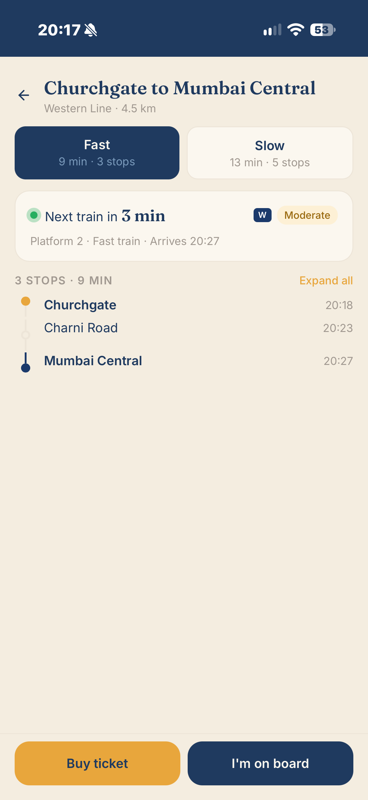
Journey Detail is the convergence point for every entry path in the app. Whether Priya taps her Home widget, Arjun searches from Routes, or either of them selects a departure from Live Status - they land on the same screen, with density adjusted to match their mode.
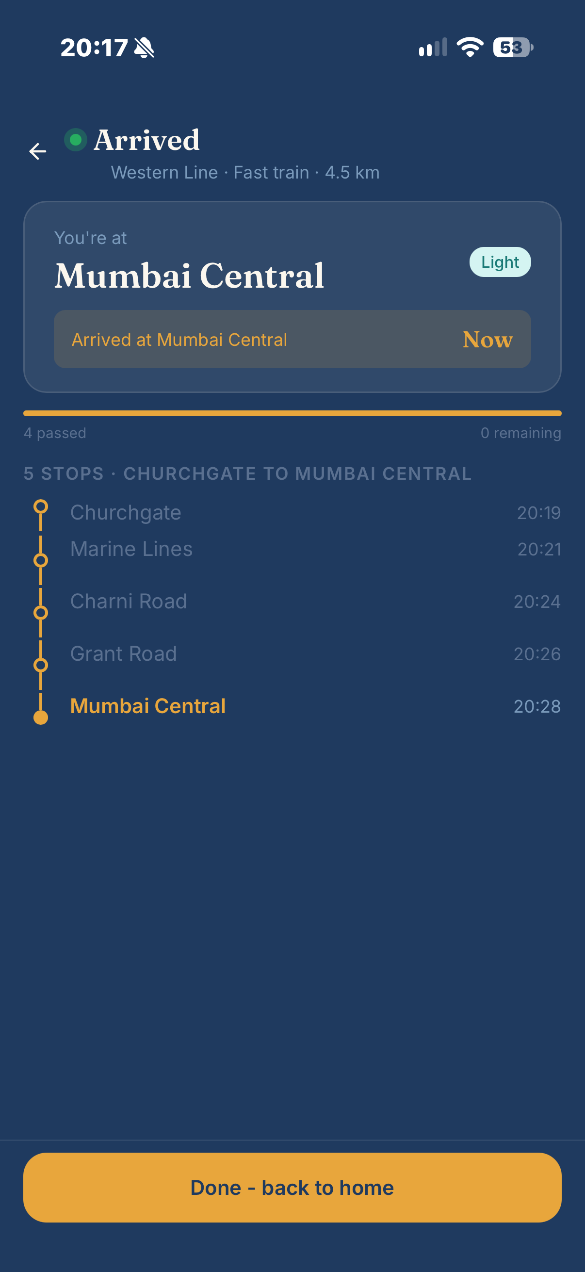
The “I’m on this train” tap transitions to On Board - a screen that did not exist in the original IA but was added after tracing the end-to-end flow revealed a real gap. Journey Detail tells you about the trip before it starts; nothing previously covered the trip while it is happening. For Arjun, On Board shows a large stop-progress tracker with a countdown to his destination and an explicit alert promise. For Priya, a compact next-stop line and an exit-side tip.
Ticket purchase directly overlaps with Mumbai One - a scope decision stated plainly rather than smoothed over
Adding ticket purchase was the one place scope crept in after the IA felt settled. The difference from Mumbai One is architectural: ticketing here is one tab among four, not the organizing purpose. The goal is not to out-build Mumbai One’s payment infrastructure - it is to remove one real point of friction: leaving the app mid-journey to buy a ticket elsewhere.
This is a genuine trade-off. Tickets took the nav slot that Saved Routes originally held. Saved routes stepped down to a low-emphasis Home widget rather than keeping a promoted destination of their own. The case study names this directly because a portfolio piece that only shows the decisions that worked out cleanly is less credible than one that shows the actual trade-off being weighed.
Warm and vibrant, pulled from Mumbai itself - heritage and calm over loud and current, because the app’s job is to reduce anxiety in a stressful moment
The palette draws from the city’s own visual vocabulary: the Western Line’s indigo rakes, auto-rickshaw yellow-and-black, the rust-red of BEST buses, and the warm cream of old railway signage.
Palette
- Marigold #E8A63C: Primary brand accent - deliberately not red, since red is already taken by BEST buses, the Central Line, and m-Indicator’s own brand
- Indigo #1F3A5F: Headers and primary text - grounds the marigold against something calmer
- Rust Red #C1502E: Secondary accent, used sparingly
- Warm Cream #F4EDE0: Background - not white (too clinical) or dark (already used by existing redesign concepts)
- Warm Charcoal #3D3A34: Body text
Typography & Reserved Colors
- Headers: Fraunces - a warm serif evoking hand-painted railway and shopfront signage
- Body: Inter - clean humanist sans for data-dense screens where legibility at speed matters
- Reserved: Crowd-status badges (teal/amber/coral ramp) and line-legend colors (navy Western, red Central, green Harbour, purple Metro) stay outside the brand palette - a functional badge is never visually confusable with a decorative accent
Four principles that emerged from the work rather than being decided upfront - each traceable to a specific screen or decision
Progressive Disclosure by Rider Confidence
Home changes shape entirely depending on mode - a dense next-train widget for Priya vs. an expandable “New to Mumbai trains?” card for Arjun. On Board is the clearest proof point: Arjun gets a large stop-countdown with an alert promise, Priya gets a compact next-stop line and an exit-side tip. Same screen, same trigger, genuinely different tools for genuinely different anxieties.
Answer the Question, Don't Just Show the Data
Every existing app shows schedules and lets the rider interpret them. This app’s headline feature is a recommendation, not a readout: “wait or board now,” with the reasoning stated in one line. The bar for adding this feature anywhere was that it had to change what the rider does, not just what they see.
Converge, Don't Proliferate
Every new capability discovered during the wireframe pass - station selection, the network map, fare depth, error states - was built as a shared component reused across screens, not a new destination added to the sitemap. A direct reaction to the competitive teardown: this app grows by making its existing screens do more.
Name the Trade-Offs Instead of Hiding Them
Adding ticket purchase directly overlaps with Mumbai One and demoted Saved routes from a tab to a widget. Both are stated plainly rather than smoothed over. A portfolio piece that only shows the decisions that worked out cleanly is less credible than one that shows the actual trade-off being weighed.
What held up, what didn’t, and where this project goes from here
What held up. Progressive disclosure survived contact with every screen it touched without needing a special case. That is the strongest signal the principle was real rather than a nice sentence: it kept generating consistent answers all the way through, instead of running out partway.
What I’d revisit. Adding ticket purchase mid-process was the right call for a fuller product, but it is the one place scope crept in after the IA felt settled. Doing it again, I would pressure-test the full feature list - including ticketing - before locking Home’s nav, rather than discovering the need for a fourth tab after three were already drawn.
Where the flowchart pass earned its keep. Two real gaps only surfaced once the screens were traced end-to-end: Live Status had no path to a destination, and the trigger for On Board was undefined. Both are the kind of gap that is invisible screen-by-screen and obvious the moment you ask “and then what happens?”
What building caught that wireframing didn’t. Reviewing the app as an actual clickable prototype surfaced that primary inputs were sitting near the top of the screen - fine in a flat mockup, a real one-handed reach problem on an actual phone. Repositioning thumb-used elements toward the bottom half is a small change with an outsized effect on daily usability.
The honest limitation. This stays a conceptual case study. Crowd density and live GPS positioning are designed against a realistic data strategy (RailRadar’s API, a historical model, opt-in self-reporting), but none of it is wired up to real data. Whether the “wait or board now” recommendation is actually trustworthy in practice is a question only real usage could answer.
Future work. Usability testing the confidence-mode toggle - specifically, whether real newcomers to Mumbai’s trains would self-identify accurately at onboarding, or whether the mode needs to earn trust more gradually than a single first-launch question allows. Additionally, restructuring the Explore tab to remove a redundant “Plan” section and having completed trips populate Home’s Daily Commute list with real data instead of placeholders.
- A confidence-mode system (Home, Live Status, Journey Detail, On Board) that flexes for two concretely different personas from one underlying structure - reversible with a single toggle rather than requiring separate apps or onboarding paths.
- A complete information architecture (4 tabs, 1 persistent settings icon, 3 shared components, full edge-state coverage) that stayed disciplined in scope even after ticketing was added mid-process.
- A named, realistic data strategy (RailRadar API + historical modeling + opt-in self-reports) in place of hand-waving - the kind of grounding that holds up under a reviewer's 'how would this actually work?'
- Traced the full end-to-end flow through a flowchart pass that surfaced two real gaps invisible in screen-by-screen review - Live Status had no path to a destination, and On Board's trigger was undefined.