Case study · Mobile · 2026
Toggle Redesign
A time-tracking app UX improvement
A UX redesign of the Toggl Track time-tracking app - focused on reducing scroll fatigue, adding filtering and sorting, and helping users with multiple projects find past entries faster.
Toggle Redesign tackles the scroll fatigue that power users hit when a time-tracking app becomes their daily workhorse.
Toggl Track is a popular time-tracking app used by freelancers, students, and professionals to log hours across projects and clients. But as users accumulate entries, the home page becomes a long, undifferentiated list. There’s no way to feature, sort, or filter projects - finding a specific client’s entries from last week means scrolling through everything logged since.
The goal was to redesign the home page experience so users with multiple projects, clients, and recurring tasks could locate past entries quickly - without losing the simplicity that makes Toggl approachable in the first place.
We designed around Shubham, a 23-year-old student juggling coursework and a part-time job at SFU IT Services
Shubham uses Toggl daily to track hours across school projects, work clients, and personal tasks. His frustrations are common among power users: the home page can’t be sorted or filtered, favourite tasks can’t be pinned, and finding a specific client’s entries requires scrolling through every entry on the page.
Profile
- Age: 23, student working part-time at SFU IT Services
- Usage: Multiple entries daily across school, work, and personal projects
- Workflow: Tracks hours for different clients and recurring tasks
Goals
- Time management: Track study hours and part-time work efficiently
- Job tracking: Log and verify hours for SFU IT Services
- Filtering: Ability to track and filter work by project or client
Frustrations
- No sorting: Can’t feature or sort projects on the home page
- Endless scrolling: Has to scroll through every entry to find past work
- No quick access: Favourite and recurring tasks aren’t surfaced
Shubham’s manager asks him to verify last week’s hours - a simple request that exposes the app’s biggest friction point
Shubham has been swamped with work at SFU IT Services recently, and his manager wants him to verify how many hours he punched in the last week. He opens Toggl to check - but finding his SFU IT Services entries means scrolling past every other entry he’s logged. With the redesigned filtering and sorting, he can now isolate his work client’s entries instantly and get back to his manager in seconds.
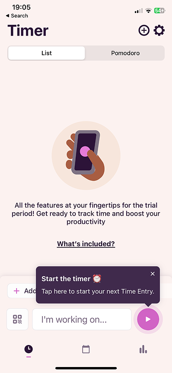
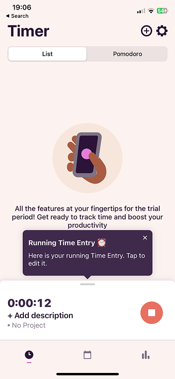
The redesign focused on three moments in the user flow: starting a timer, tracking a running entry, and adding project context
The existing Toggl interface handles the basics well - starting and stopping timers is fast and intuitive. The redesign preserved that simplicity while layering in the filtering and sorting features that power users need. Each screen was evaluated against Shubham’s workflow: can he find last week’s SFU IT entries in under ten seconds?
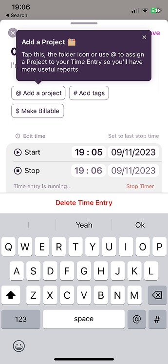
The add-entry flow was streamlined to encourage project tagging from the start - the more entries are tagged, the more useful filtering becomes later.
Future iterations would deepen customisation and reduce the steps between question and answer
Advanced filtering and sorting would let users pin most-used projects to the home page and filter by client, project, or favourites to eliminate scrolling. Quick search and presets like “Last Week’s Work” or “Frequent Clients” would surface entries without manual filtering.
Navigation improvements including collapsible list views and a “jump to date” function would minimise scrolling for users with hundreds of entries. Recurring task shortcuts with one-click access to frequently logged tasks and auto-suggest for common tags would speed up daily logging.
Productivity integrations like calendar sync and weekly report exports would connect time tracking to the broader workflow. These features would transform Toggl from a logging tool into a productivity dashboard.
Four principles guided the redesign - balancing power-user needs with the simplicity that makes Toggl work
Reduce Friction
Every extra scroll or tap to find an entry is friction. Filtering, sorting, and pinning put past work within reach without changing the core logging flow.
Tag Early
The more context users add at entry time - project, client, tags - the more powerful filtering becomes later. Surface tagging upfront, not as an afterthought.
Scalable Layout
The interface should work as well with 500 entries as it does with 5. Collapsible lists, date jumps, and filters keep the home page functional as data grows.
Respect the Core
Toggl’s strength is fast, simple time tracking. New features layer on top of the existing flow, never replace it.
This project reinforced how small navigation friction compounds into real usability pain at scale
Friction hides in frequency. Scrolling past ten entries once is nothing. Doing it five times a day, five days a week, for months - that’s the frustration users actually feel. Sorting, filtering, and quick access features aren’t power-user luxuries; they’re table stakes for anyone who uses the app daily.
Information hierarchy matters more than visual polish. The wireframing and prototyping phases showed that small UI changes - dropdown filters, collapsible lists, date-jump shortcuts - had a bigger impact on efficiency than any visual refresh could.
Flexibility beats prescription. Feedback from mentors and user testing emphasised that different users have unique workflow needs. A student tracking coursework and a freelancer logging billable hours need different views of the same data. Customisation, not one-size-fits-all, is the answer.
- A filtering and sorting system that lets users with multiple projects and clients find past time entries without endless scrolling.
- A redesigned home page that surfaces pinned projects, recent clients, and favourite tasks - putting the most-used entries within reach.
- A streamlined workflow that takes Shubham from manager request to verified hours in seconds, not minutes of scrolling.