Case study · Web · 2025
Adventure Awaits
A BC camping discovery website
A camping discovery website for BC families - designed to help first-time campers find, compare, and book campsites with confidence. Built around clarity, bright visual language, and mobile-first usability.
Adventure Awaits is a camping discovery website for BC families who want to explore the outdoors but don’t know where to start.
First-time campers face a common set of frustrations: they don’t know how or where to start, it’s hard to find what activities are offered at each campsite, and booking information is scattered across multiple sources. The site needed to make campsite discovery feel approachable - not overwhelming.
The goal was a single destination where families could quickly overview a campsite, view prices and booking links, and plan activities - all in a visual language that felt fun, friendly, and family-oriented.
We designed around Blake, a 43-year-old high school teacher looking to take his family camping for the first time
Blake is excited to explore the wilderness with his family but doesn’t know where to begin. He needs an easy way to pick a starter campsite that’s safe and fun. His frustrations are common among first-time campers: scattered information, unclear booking paths, and no sense of what to expect.
Profile
- Age: 43, married, high school teacher
- Experience: First-time camper
- Attitude: Excited to try new outdoor activities with family
- Interest: Nature and the outdoors
Motivations
- Exploration: Wants to start exploring the wilderness
- Simplicity: Find an easy way to pick a starter campsite
- Safety: Camp at a safe camping ground for his family
Frustrations
- Getting started: Didn’t know how or where to begin
- Information gaps: Hard to find what activities are offered at campsites
- Booking access: Scattered booking information across multiple sources
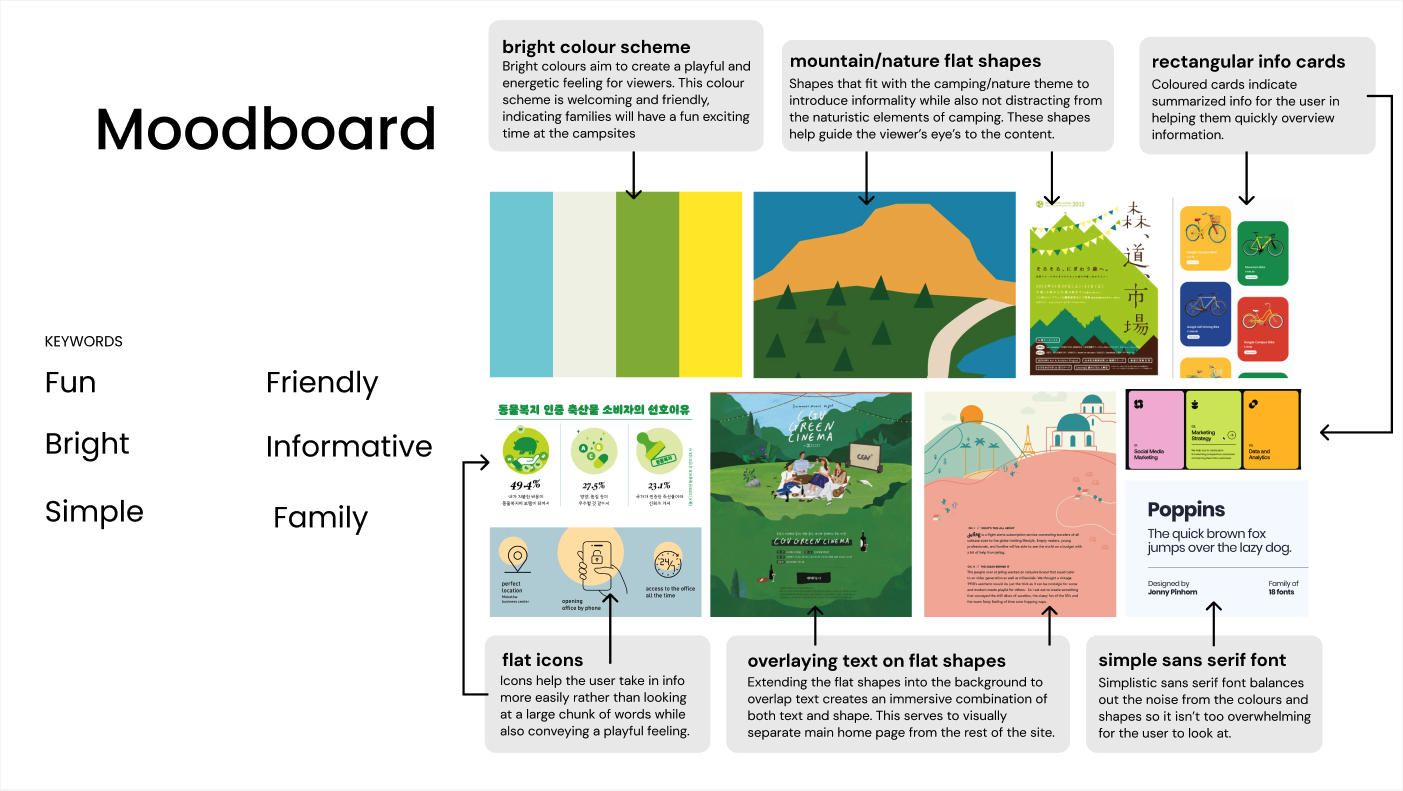
The moodboard established six keywords that drove every visual decision: fun, friendly, bright, informative, simple, and family
A bright colour scheme creates a playful and energetic feeling - welcoming and approachable, signalling that families will have a fun time at the campsites. Mountain and nature flat shapes introduce informality without distracting from the content, while rectangular coloured info cards summarize details in a scannable format.
Flat icons help users take in information more easily than large blocks of text, while conveying a playful tone. Overlaying text on flat shapes extends the nature theme into the background and creates visual hierarchy. Poppins, a simple sans-serif font, balances out the visual noise from the colours and shapes so the interface doesn’t overwhelm.
Four key design decisions shaped the final interface - each one solving a specific usability problem for first-time campers
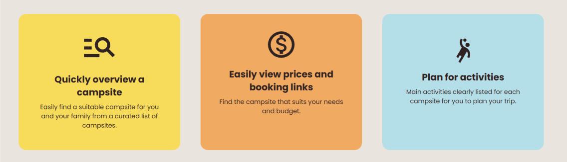
Information cards with icons summarize the site’s core value propositions in a visually appealing and easily digestible way - critical for busy families with limited time. Each card pairs a flat icon with a short pitch: quickly overview a campsite, easily view prices and booking links, and plan for activities.
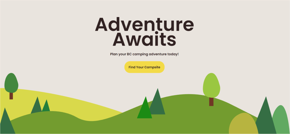
Framing main headings with nature shapes draws the user’s eye and creates hierarchy. The hero section uses layered green hills and illustrated trees to frame the “Adventure Awaits” heading, making the first impression feel immersive rather than flat.
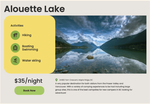
Contrasting colours differentiate sections, making it clear what actions users should focus on - the “Find your Campsite” and “Book Now” call-to-action buttons stand out against the nature-toned backgrounds.
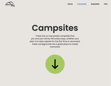
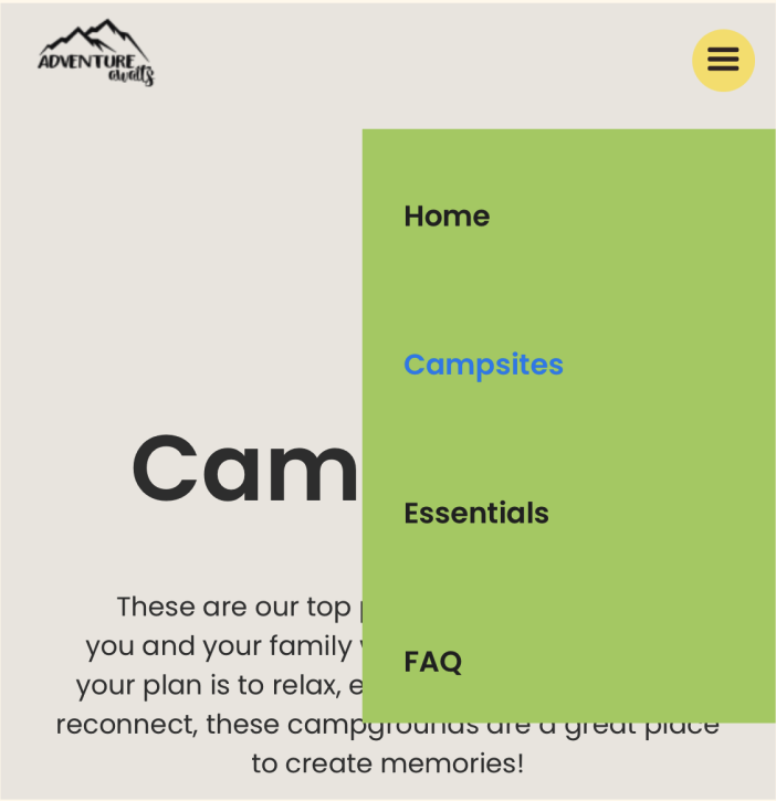
On mobile, the navigation collapses to a hamburger icon with the search icon highlighted, facilitating intuitive browsing for users who access the site on their phones.

Four principles kept the design family-friendly without sacrificing usability
Every decision was checked against whether Blake - a first-time camper with his family - could complete the task on the first try.
Playful Clarity
Bright colours and flat shapes create energy, but simple sans-serif type and structured layouts keep the information readable and scannable.
Scannable Content
Rectangular info cards, flat icons, and short copy let busy families absorb key details at a glance without reading paragraphs.
Clear Actions
Contrasting colours on call-to-action buttons make the next step obvious - find a campsite, view details, or book now.
Mobile First
Responsive layouts, a hamburger menu with highlighted search, and touch-friendly targets ensure the experience works where families actually browse - on their phones.
Future iterations would deepen personalisation and build community around the camping experience
An interactive campsite finder with personalised recommendations and filters for beginner-friendly sites, activities, and amenities would reduce decision fatigue. A community section for reviews, photos, and Q&A forums would help first-time campers learn from others, while gamification features like badges and rewards could boost engagement.
Accessibility enhancements - voice search and a high-contrast mode - would improve usability for all users. Integrating real-time campsite availability and weather updates would make the booking process feel more trustworthy and reduce the back-and-forth of checking external sources.
This project taught me how to balance visual energy with functional clarity
Bright colours work when the layout does the heavy lifting. The playful palette was effective in making the experience engaging and family-friendly, but maintaining clarity and readability was crucial. Simple sans-serif fonts and structured layouts balanced the visual noise.
First-time users need clear next steps, not more options. Users like Blake struggle with decision-making, so clear call-to-action buttons significantly improved navigation. Users prefer quick, summarised information, making the rectangular info cards an effective way to communicate details.
Mobile isn’t a secondary concern - it’s the primary one. Since many users access the site on mobile, ensuring intuitive navigation, responsive design, and clear search functions was key. The hamburger menu and search bar highlight made browsing easier.
Iterative feedback catches what assumptions miss. Usability tests showed that users valued visual differentiation for sections but needed clearer actionable steps for booking. Mentor guidance reinforced the importance of contrasting colours for clarity while ensuring the UI remains cohesive.
- A campsite discovery experience that answers the three questions first-time campers ask: where do I go, what can I do there, and how do I book - in that order.
- A visual language built around bright colours, flat nature shapes, and simple sans-serif type that feels playful and family-friendly without sacrificing clarity.
- A responsive layout that collapses navigation to a hamburger with a highlighted search icon, keeping browsing intuitive on mobile.