Case study · Web · 2024
Clove By Quantum
A premium townhome development website
A marketing website for a collection of 11 modern townhomes in Cloverdale, Surrey. I led design and development solo - from discovery through launch - in 30 days.
CLOVE is a collection of 11 premium townhomes in Cloverdale, Surrey - and when the project started, it had zero online presence.
Prospective buyers had no way to browse floor plans, understand the neighbourhood, or register interest without physically visiting the sales centre. In a market where most buyers start their search online, that gap was costing reach.
The site had to serve three jobs at once: showcase the development with renders and floor plans, sell the neighbourhood to people who may never have heard of Cloverdale, and capture leads for the sales team. All of it within 30 days, working solo.
The process started with the client’s goals - who are the buyers, what do they need to see, and in what order
Two priorities surfaced quickly. First, the hero moment had to feel premium - a video walkthrough, not a static image. Second, the site needed to sell Cloverdale itself, not just the homes. Many buyers in the Lower Mainland don’t know the area, so a dedicated location section was essential.
I mapped the site into five sections: Home (hero video, about snippet, location teaser, contact), Features (interior details and renders), Location (neighbourhood amenities and map), Gallery (photography), and a persistent registration CTA across all pages.
Showcase
- Hero video: Walkthrough starting at a curated timestamp
- Floor plans: Dedicated Features tab with renders and specs
- Gallery: Photography that loads without the performance issues of earlier attempts
Sell the Area
- Location tab: Dedicated experience answering “why Cloverdale?”
- Amenities grid: Recreation, education, shopping, and healthcare
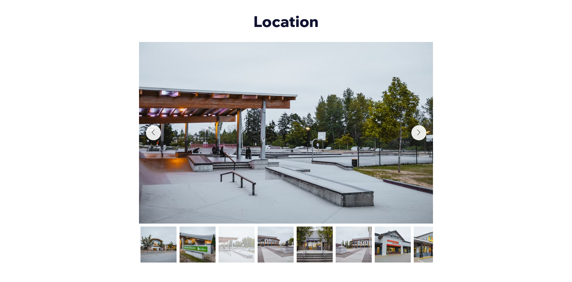
- Neighbourhood gallery: Real photos of local landmarks
Capture Leads
- Registration CTA: Persistent across all pages
- Sales advisor: Contact card on every page footer
- Zero dead ends: Every page closes with a next step
The build was iterative - prototyping in Figma, building the site, and incorporating client feedback at every stage
Key revisions shaped the final product. The entrance video was swapped for a version starting at a specific timestamp that better represented the development. The “About Clove” heading was enlarged for visual hierarchy. A new Location teaser section was added with a “Read More” CTA leading to the dedicated Location tab - content that had been buried was now discoverable from the front page.
The original embedded video on the About page was replaced with a high-resolution townhome render - a static focal point that loaded faster and communicated more. The Quantum Properties logo was added to reinforce the developer’s reputation. Content was streamlined to focus on one thing: who Quantum is and why that matters.
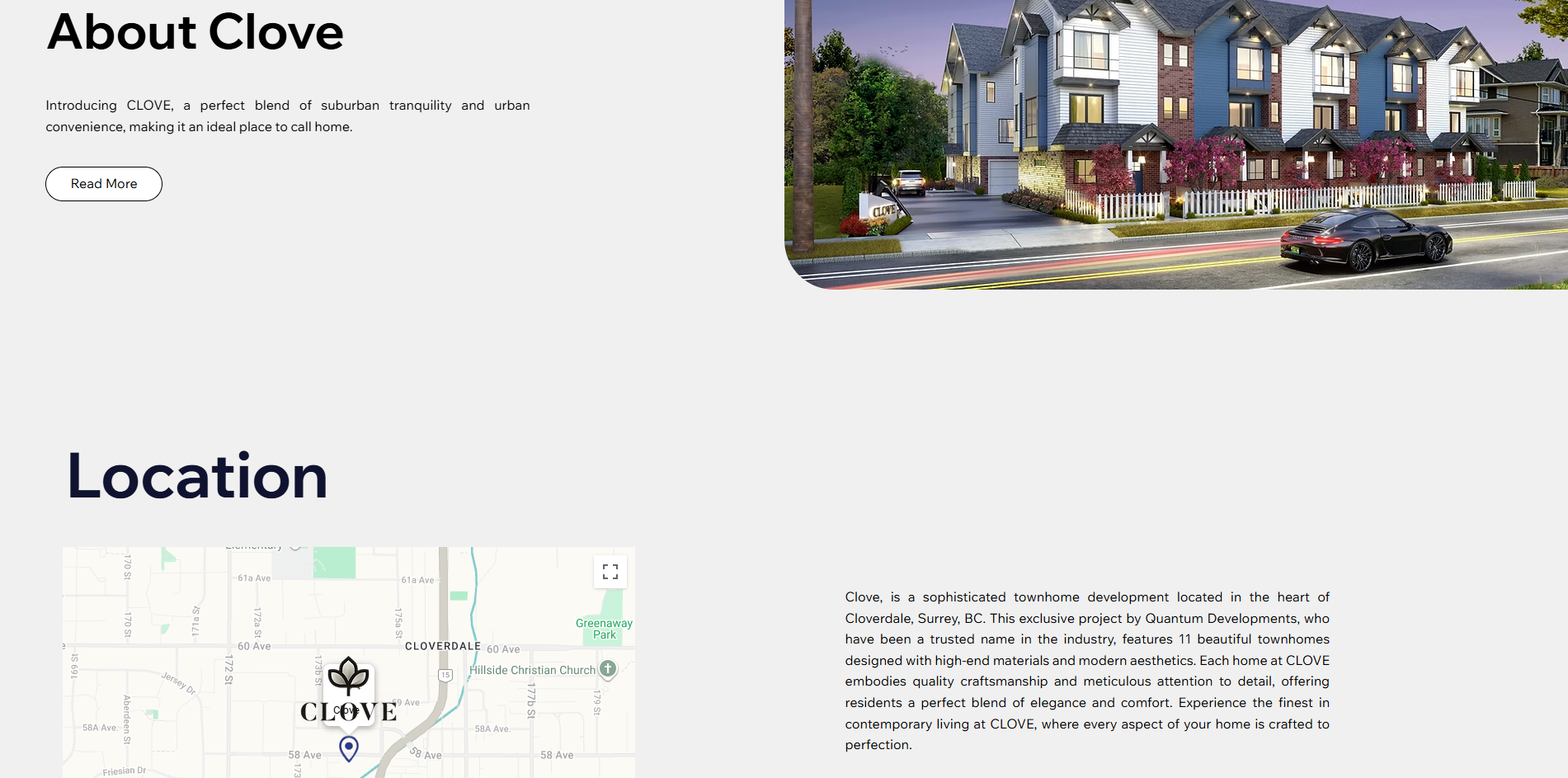
Making Cloverdale itself feel like a feature of the product was one of the more interesting design problems
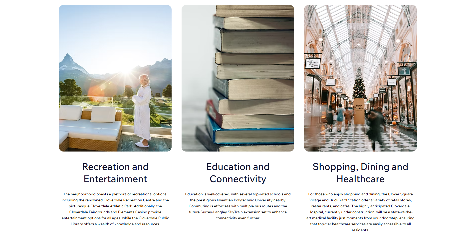
Many prospective buyers knew Surrey but not this specific corner of it. The Location tab needed to answer “why here?” before the buyer ever asked. The Features tab consolidated interior details and renders that had been scattered across the About page. The Location tab became its own experience - a three-column amenities grid covering recreation, education, shopping, and healthcare, backed by a photo gallery of the neighbourhood.
The solution was a dedicated gallery of neighbourhood landmarks - the skate park, local shops, community centres - presented in a carousel that felt editorial, not like a stock-photo dump. Combined with the amenities grid, the page builds a picture of daily life in the area, not just proximity data.
Zero dead ends - no matter where a visitor finished reading, the next step was always visible
The bottom of every page closes with the same structure: the sales advisor’s contact card, a direct link to the sales centre, and a persistent registration CTA. No scrolling required to take the next step.

Four constraints shaped every decision across the 30-day build
Working solo meant every principle had to pull double duty - guiding the design while keeping the scope honest enough to ship on time.
Premium First
Hero video, high-res renders, and generous whitespace. The site had to stand alongside established developers - stock photos and template layouts weren’t an option.
Sell the Place
The homes were the product, but the location was the pitch. Structuring the site to sell Cloverdale first changed the entire information architecture.
No Dead Ends
Every page closes with a next step - registration, contact, or deeper content. A visitor should never finish reading without knowing what to do next.
Performance
The client’s earlier gallery attempts had loading issues. Solving that wasn’t a dev task bolted on at the end - it was a design constraint from day one.
This was a solo build from blank page to production in 30 days - and it taught me where my defaults are
Selling a neighbourhood is a design problem. The homes were the product, but the location was the pitch. Structuring the site to sell Cloverdale first and the townhomes second changed the entire information architecture - and it was the right call.
Iterative client feedback saves time, not costs it. Every round of revisions caught something that would have been harder to fix after launch. The video timestamp change, the About page simplification, the new tab structure - all came from feedback loops, not the first draft.
Performance is part of the design. The client’s earlier gallery attempts had loading issues. Solving that wasn’t a dev task bolted on at the end - it was a design constraint from day one that shaped how the gallery was structured.
Solo projects teach you where your defaults are. Without a team to challenge decisions, I had to be my own critic. The discipline of justifying each choice - even privately - caught assumptions I would have shipped otherwise.
- A live production site that moved from zero online presence to a full lead-generation funnel - hero video, floor plans, sales registration, and location discovery.
- An information architecture that reorganized scattered content into dedicated Features, Location, and Gallery tabs - each with a clear purpose and user path.
- A responsive build that loads the photo gallery without the performance issues the client had flagged on their previous attempts.