Case study · Mobile · 2026
SeniorCircle
A social discovery app for seniors 75+
A social discovery and events app for adults 75 and older - built around accessibility, community, and the loneliness that follows retirement. I led UX from research through hi-fi, with two collaborators on the design side.
SeniorCircle is a social discovery app for adults 75 and older - a group most consumer apps are designed against, not for.
General-purpose event apps optimize for choice and density, which is exactly what someone with aging vision, reduced motor precision, and lower digital confidence finds overwhelming. A senior-first app is not a seniors-only app - it’s the same job, done at a different tempo.
SeniorCircle helps seniors discover local events tailored to their interests, book seats, and see which events their friends are already going to. Older users don’t need a stripped-down toy. They need larger type, simpler navigation, and features that address the real reason they downloaded the app in the first place: they’re lonely.
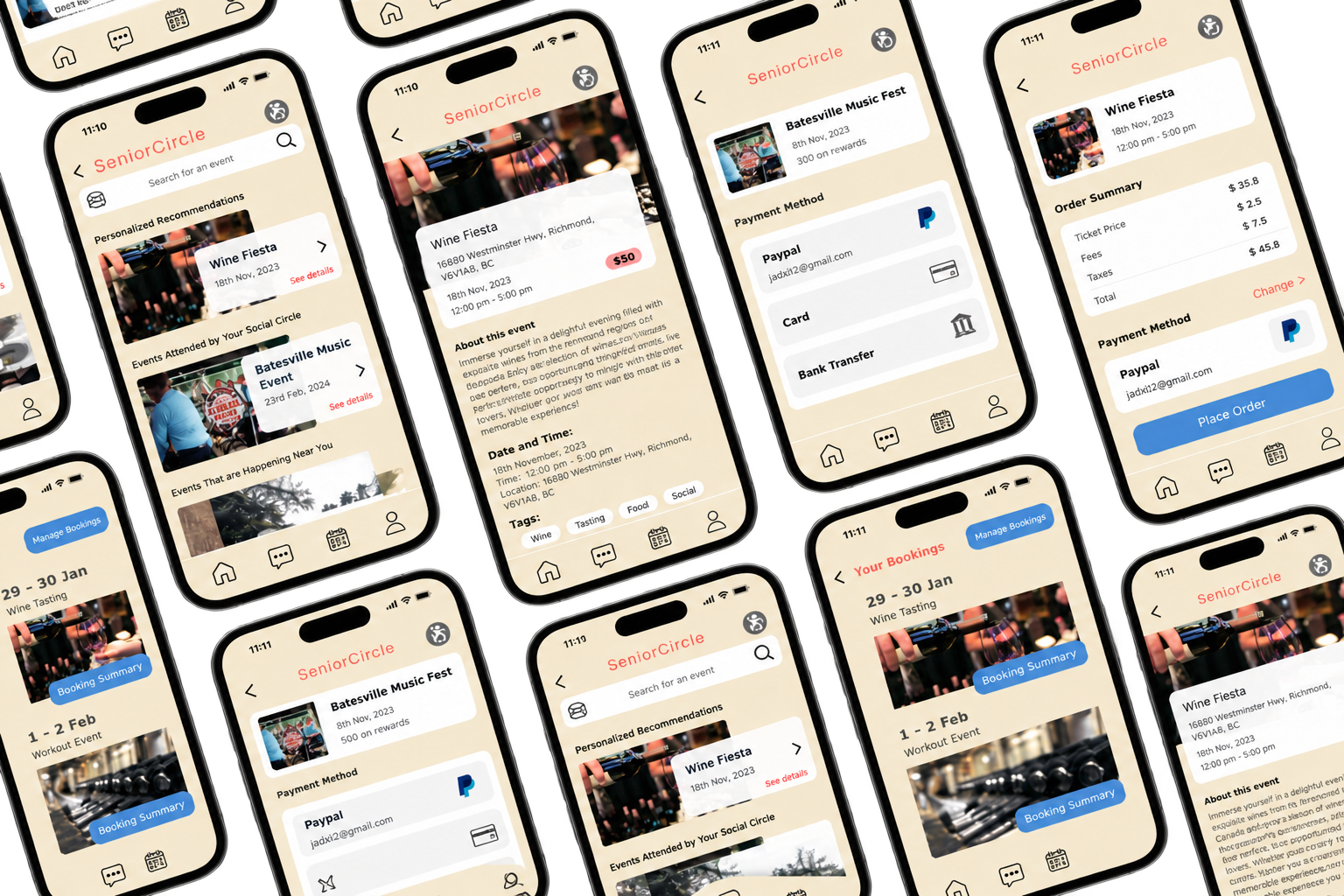
We built the design around one specific person: Arsh Singh, a 70-year-old retired schoolteacher who recently moved to Canada
He spends most of his days alone while his son and daughter-in-law are at work. His technology proficiency is intermediate - comfortable with a phone but not fluent - and he wears corrective lenses. Arsh became our design constant. Every decision - type size, gesture, information order - was checked against whether he could complete the task on the first try.
Profile
- Age: 70 years old, retired schoolteacher
- Location: Recently moved to Canada to live with his son
- Tech fluency: Intermediate - comfortable with a phone but not fluent
- Accessibility: Wears corrective lenses
Goals
- Social connection: Engage in social activities with people who share his interests
- Community: Meet new people and build a community in a new country
- Interests: Reading, praying, walking
Pain Points
- Discoverability: Can’t find where to look for events and community
- Platform mismatch: Facebook events are dominated by younger crowds
- Assumptions: Existing apps assume he already knows the local scene
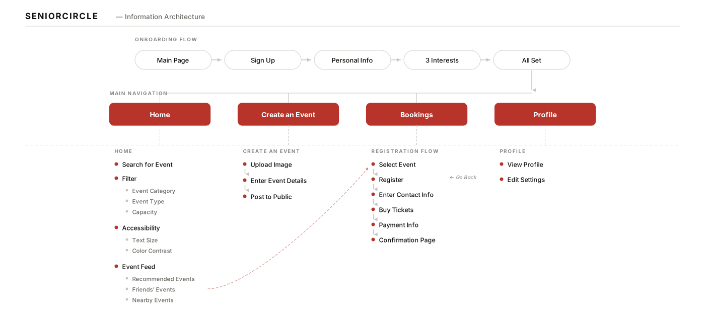
We started with a full information architecture pass - mapping every screen the app would need and how a user would move between them
Working this out on paper before opening Figma kept us honest about scope for a three-week project. Login and profile setup collapse into a five-step signup that ends on the home screen. The four main tabs are Home, Create an Event, Bookings, and Profile.
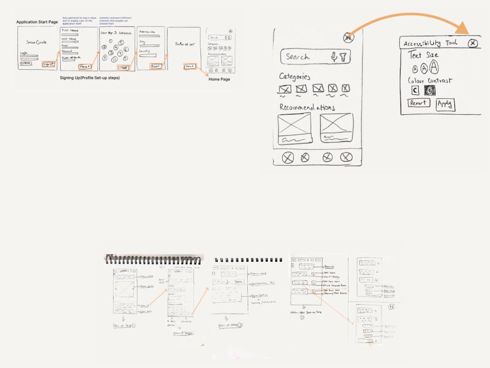
From there we sketched interfaces in pencil first - fast, cheap, and honest. Working at low fidelity forced us to test layout and hierarchy before getting attached to visual polish.
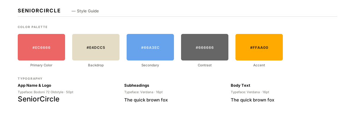
The style guide is where accessibility became a design constraint, not a compliance checklist
We chose Bodoni 72 Oldstyle for the app name - a familiar warm serif for a demographic that grew up reading in serif - paired with Verdana as the workhorse body face, chosen for its exceptionally wide apertures and unambiguous letterforms at large sizes. A muted red functions as the primary action color, cream as the backdrop for reduced eye strain, and blue as the secondary for state and confirmation.
Through our research and iteration, we aligned around four guiding principles that shaped every design decision
These principles helped balance accessibility with engagement - ensuring that the SeniorCircle experience felt both welcoming and capable.
Legibility
18pt minimum body type, high-contrast color pairings, and generous whitespace so every screen reads comfortably with corrective lenses.
Simplicity
One task per screen, plain-language copy, and a flat navigation structure that never makes the user guess where they are.
Community
Events friends are going to surface first, then events nearby, then personalized recommendations - social proof drives engagement.
Trust
Generous tap targets, forgiving input fields, and confirmation steps that reduce anxiety around accidental actions.
This was a formative project - the first time I built for a group I’d never been part of
Designing for a demographic you’re not part of takes humility. Every assumption I made early - that seniors want “simple,” that they don’t want animation, that they need a tutorial - was wrong in some way. Personas and interviews caught the drift before it shipped.
Aesthetics and function aren’t in tension when the aesthetics are the function. The warm serif and cream palette look editorial, but their primary job was legibility and warmth. That’s not decoration.
Prototyping early saves the expensive revisions. ProtoPie let us put the signup flow in front of two seniors before we had touched hi-fi. Their confusion at step 3 rewrote the flow before it was drawn.
Collaboration keeps the design honest. Working with Jaival and Harsh meant every choice had to be defended out loud. Half of my best decisions were their pushback. The learnings ripple through everything I’ve designed since.
- A tested design system tuned for aging vision and motor skills - 18pt minimum body type, high-contrast colors, generous tap targets.
- A signup flow that treats onboarding as a first-impression, not a form to survive - three steps, plain-language copy, one interest choice per screen.
- An information architecture that puts community first - events friends are going to, events nearby, and personalized recommendations, in that order.